Organizer
Overview
Organizer effortlessly and securely manages your email. Receipts, newsletters, and more are instantly organized into folders, saving your email inbox for what is most important to you. It uses the Context.IO API for email synchronization. Organizer works across all major email providers, and supports most IMAP enabled mailboxes like Gmail, Yahoo, Microsoft, Comcast, Cox, and AOL.
This is a legacy product from Other Inbox that our team inherited.
The Challenge
After reviewing with business stakeholders, our key objectives were:
- Port Organizer to newer technology stack.
- Give Organizer it's own identity and separate it from it's sister product, Unsubscriber.
- Reduce churn by X%. Increase user acquisition by X% Keep new users engaged by > X%.
- Based on user feedback, reorganize the data about folder creation in a better way without creating a new feature.
My Role
As the UX / UI Designer on the project, my responsibilities included:
- Discovery: Stakeholder interviews, Business Goals, Task Analysis
- Definition: Product Flows, General UX
- Design: Style Guide, Visual Design, Prototyping, Branding, Improvement plan
Contributors
Susan Wilhelm, Chad Shinsato, Chris Duncan, Aaron Labrie, Allyson Weber, Marilyn Rogers
Style Guide
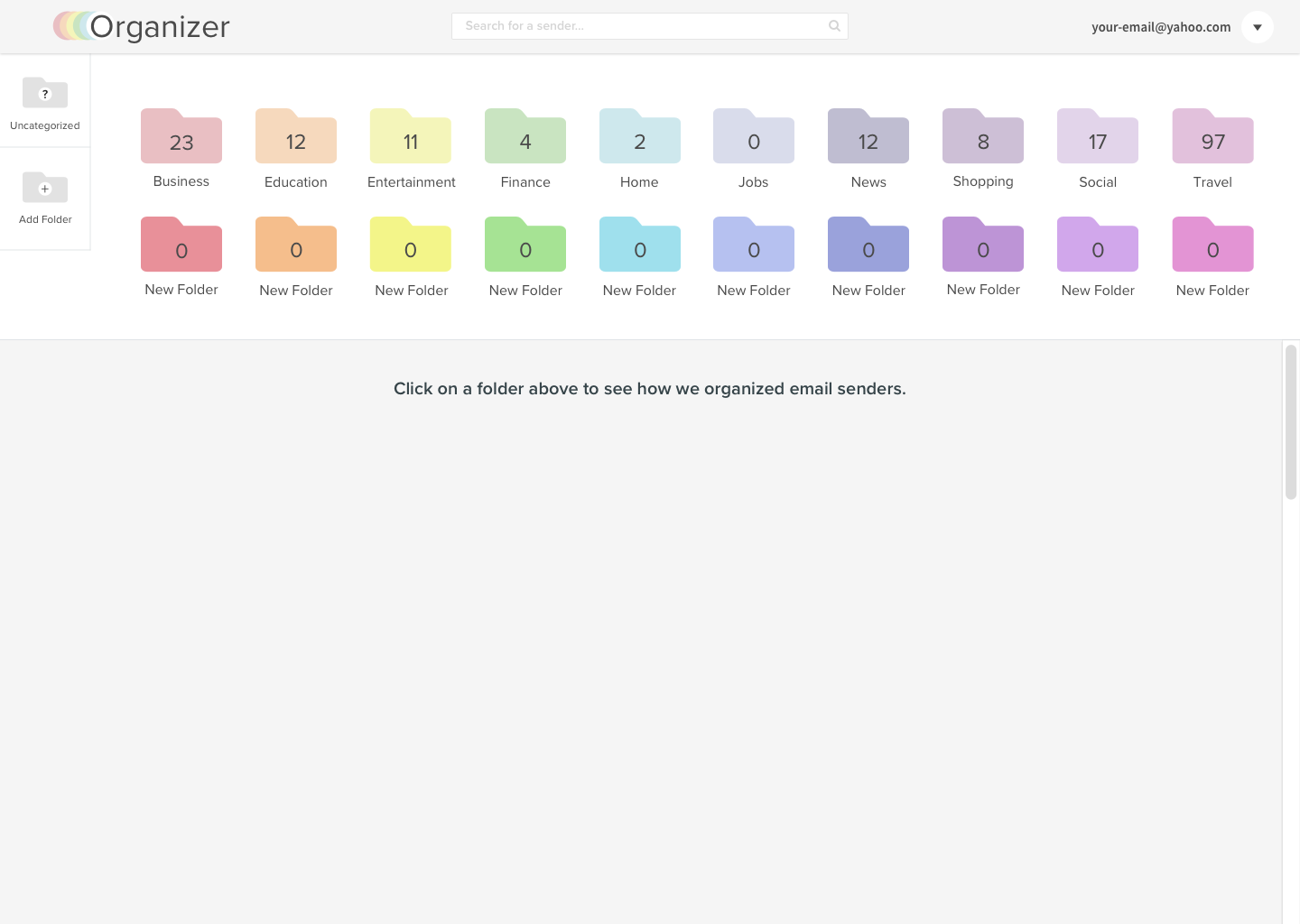
I wanted to have this product feel lightweight so I chose to play with pastels. I also intended each folder created to have a color scheme related to the category. There are twelve principal user categories and a handful of user generated folders, so I decided to play with the lighter side of the spectrum.


Landing Page
After rebranding, we increased conversion from the marketing funnel by running A/B tests and adding better content.
onboarding
After dialing in the analytics, we found a low engagement with the legacy product. There also wasn't any onboarding that explained how to use the product. We added a few screens after the sign up process that explained how. This increased engagement for new users after signup.


user settings panel
The primary action that a user needed to do was move a sender from one folder to the other by setting future rules. I reorganized the sender data in list format by domain, email, category, and color.
Responsive view
Email Design
One of the common requests from users was to bring back the daily digest email. We fixed it, reorganized the data, and designed it to emphasize the category color. Next, we added a series of emails that welcomed the user showed the user how to use the product.


alternative design
When we first started the project, I had the idea to organize uncategorized senders in the same way that Google+ organized contacts. I always liked their "drag/drop into circles" experience. My goal was to enhance a user's interaction of organizing senders by using color as a factor. After testing, unsubscribing was also important for a user at this moment. We ultimately moved on to a simpler idea based on time constraints and developer resources.


results
At the end of the project, we met all of our OKR's. We ported the technology. We reduced churn, increased acquisition and engagement.