Feather - 2017
Due to change of consumer team priorities, this project is currently on hold.
Overview
Feather (working title) is a product designed to remove unwanted email and spam. After a user syncs their email account, they're presented with intelligence (volume, read rate, and recommendation) about the email senders in their inbox given the option to unsubscribe, delete, or add to a digest. This project was designed out of culmination of all of the research and user feedback from our consumer email products: Unsubscriber, Organizer, and Whisker.
the Challenge
Based on discussions with stakeholders and our product manager the design challenge was:
- Design a product to capture a portion of the market share of a competitor, Unroll.me. Find a differentiating value proposition and test it with users.
- Solve for the time it takes for a user to sync their inbox.
- Solve for organic growth.
Contributors
Susan Wilhelm, C. Vincent Plummer, Chris Duncan, Aaron Labrie, Dane Carmichael, Dan Corbin
My Role
As sole UX / UI Designer my responsibilities were:
Discovery: Stakeholder Interviews, Business Goals, Competitive Analysis and Audit, User Interviews, Personas
- Definition: Product Flows, Value Proposition
- Design: Style Guide, Visual Design, Prototyping, Branding
Persona: Krista
testing
I created three different clickable prototypes with Invision and conducted three rounds of user interviews. I also had participants take a survey.
The chief takeaways were:
- Showing intelligence was valuable to a user when making a decision.
- People didn't mind and understood the onboarding. They were clear on the task they needed to do afterward.
- Batch Unsubscribe / Delete was delightful to all users and more popular than the Daily Digest.
- A push notification informing the user (in a reasonable amount of time) that the email scan was complete wasn't a deterrent in using the product..
In addition to this, landing page smoke tests were conducted.
Landing Page
This is a working landing page that I came up with in order to stand up the web version. The primary action a user needs to take is entering their email to get started. Our discovery engine would define the proper step for OAuth. Section two is intended to be a parallax onboarding of value proposition. Section three is for product image. I still need to add: 3rd party validation, about us, testimonials, footer, other apps built on platform, contact us, features, minor animation showing product working, user tutorial.
Onboarding
The preliminary onboarding is about establishing trust and value proposition. The secondary onboarding is designed as a tutorial about the product and the occupied wait to happen during the initial email sync.


unsubscribe / delete in bulk
The biggest pain points for users about cleaning up their inbox was:
- It took too long to do one by one and they didn't have the time.
- Some senders were easy to make decisions about. Others they were on the fence about. Having intelligence provided to them was delightful.
- Showing stats about their progress was delightful.
I designed the experiences below based on this information.
pruning: maintenance
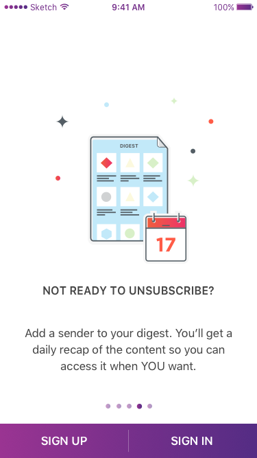
After the user goes through the initial "Paul Bunyan" phase of chopping the trees down the forest," the next phase is about maintenance and retention. The bonsai tree, if you will. The following screens were designed to give a user the ability to set ongoing rules for a sender. Either get rid of it entirely, keep it in the inbox, or add it to the shoebox under the bed (the daily digest).
Results / Key Observations
People want a simple and elegant solution for inbox management. I was excited for this project to move forward but, we're currently dealing with conflicting priorities and issues with technical feasibility.